Visualizing sequence data sets
Here we use simple visualization tools offered by TraMineR to have an overview of the sequences in the
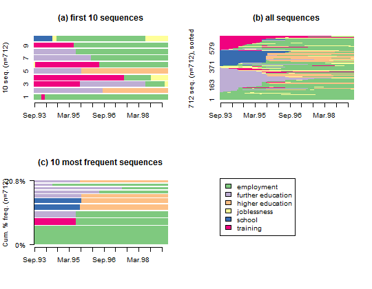
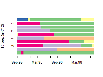
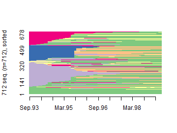
mvad data set. Sequence index plots display either selected or all sequences in a sequence object while sequence frequency plots display distinct sequences sorted according to their frequency in the data, with the width of the bar used to represent each sequence proportional to its frequency. The code used to generate the plots is given
below the Figure.
- Create a state sequence object from the mvad data set.
- Divide the graphic area in 2 rows and 2 columns (we want to include four different plots in the same figure).
par(mfrow = c(2, 2))
-
Plot the first 10 sequences in the mvad.seq sequence object.
seqiplot(mvad.seq, with.legend = FALSE, border = NA)
-
Plot all the sequences in the data set, sorted by states from start.
seqIplot(mvad.seq, sortv = "from.start", with.legend = FALSE)
-
Plot the 10 most frequent sequences.
seqfplot(mvad.seq, with.legend = FALSE, border = NA)
-
Plot the legend for the state colors.
seqlegend(mvad.seq)